PRODUCT IMPROVEMENT PROCESS
I gathered as much publically available information on Devin’s UI as possible, including (but not limited to) dev docs, demos, and user testimonies/videos. I identified the following three preliminary areas of improvement for Devin’s current user interface.
- Overlapping Communication vs Development messaging.
- Need for traceable context.
- High navigation friction and low information density.
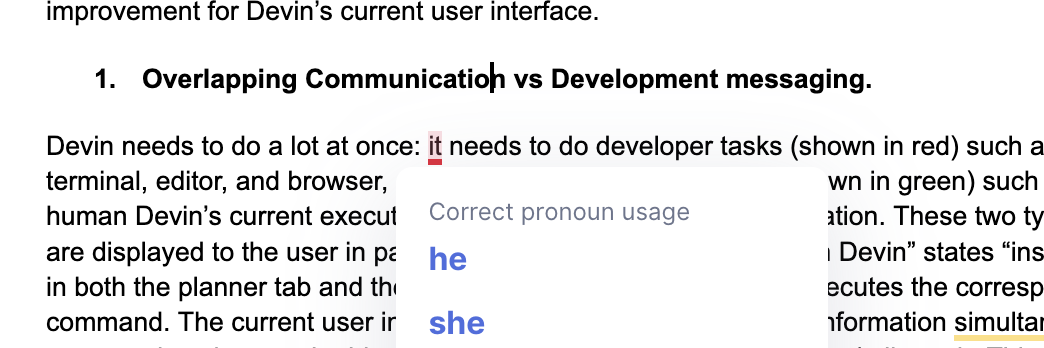
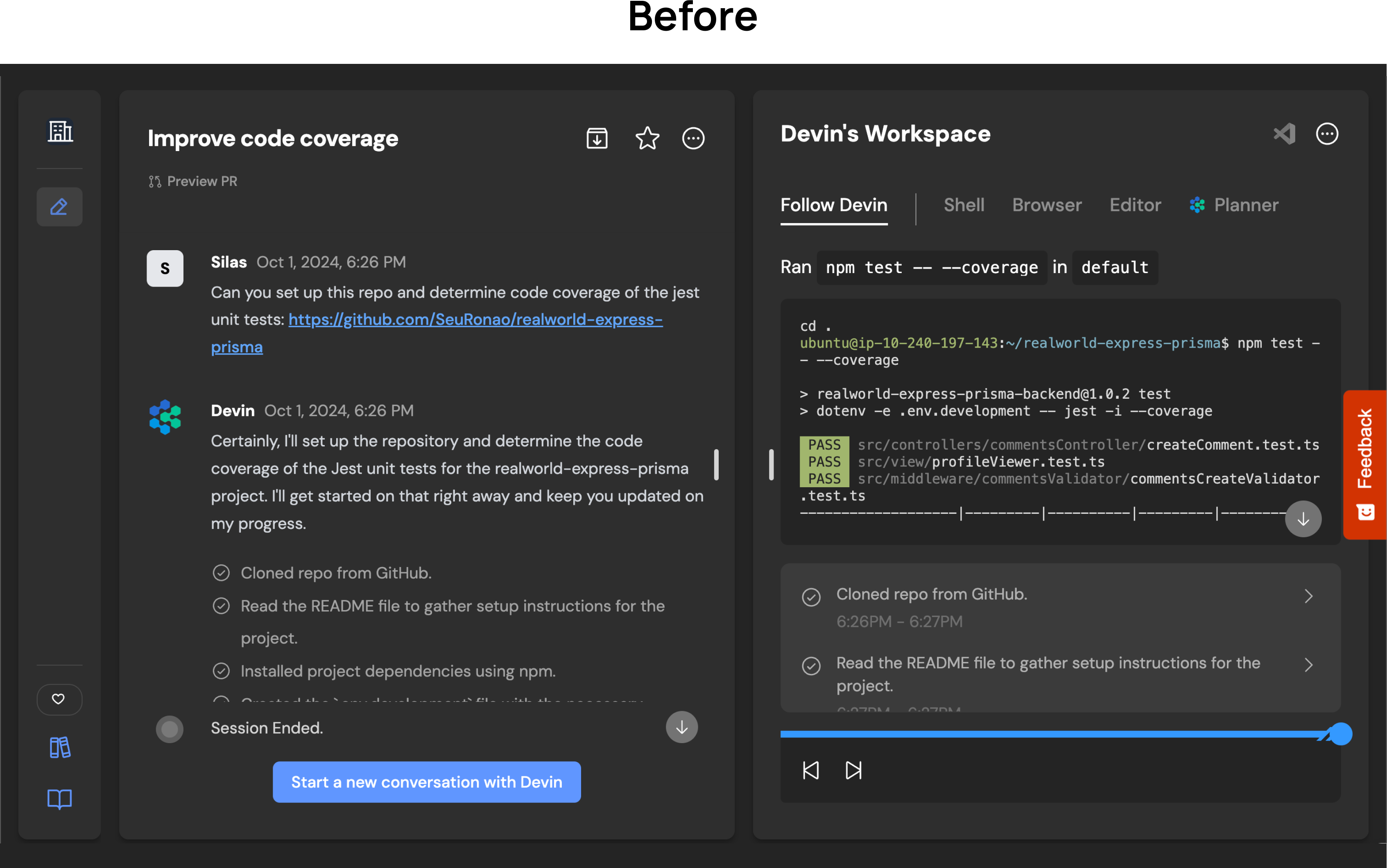
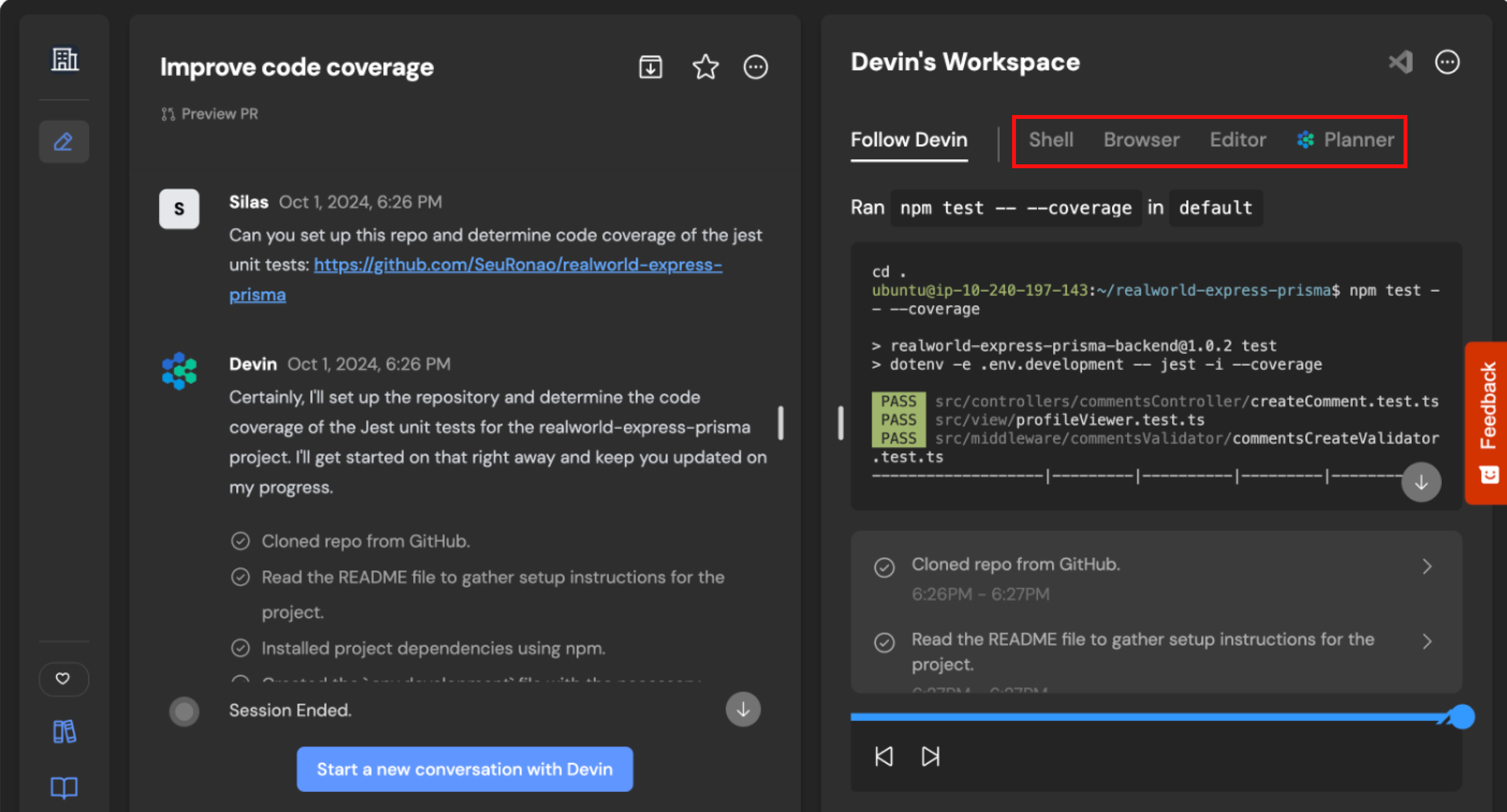
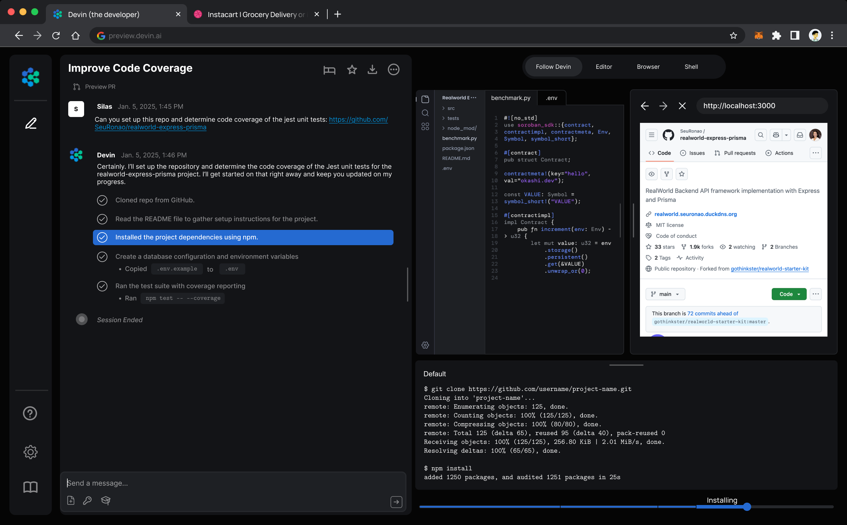
Devin needs to do a lot at once: it needs to do developer tasks (shown in red) such as typing in the terminal, editor, and browser, as well as communication tasks (shown in green) such as explaining to the human Devin’s current execution and requesting additional information. These two types of information are displayed to the user in parallel. For example, “Communication Devin” states “installed dependencies” in both the planner tab and the history, while “Developer Devin” executes the corresponding terminal command. The current user interface presents the user with new information simultaneously in three separate locations — the history, planner, and relevant shell/browser/editor tab. This creates too big of a visual difference for the user to parse quickly.
The human developer needs to be able to step away and come back to see what happened while they were gone. Scrubbing through a timeline or reviewing logs in multiple panels is a good first step to giving the human context, but it is slow, and it’s hard to pinpoint which part of the conversation triggered which action.
A user’s attention is distributed differently in a developer tool context than in a consumer tool context. Instead of following a predefined path (ex. searching for and clicking on a flight), the developer’s attention is much more chaotic, going back and forth between panels frequently. Therefore, we must reduce the friction between these actions. The current product design hides critical components that the developer may need to inspect, such as the Shell, Browser, and Editor. This is shown in red below.
SOLUTION
- Overlapping Communication vs Development messaging.
- Need for traceable context.
- High navigation friction and low information density.
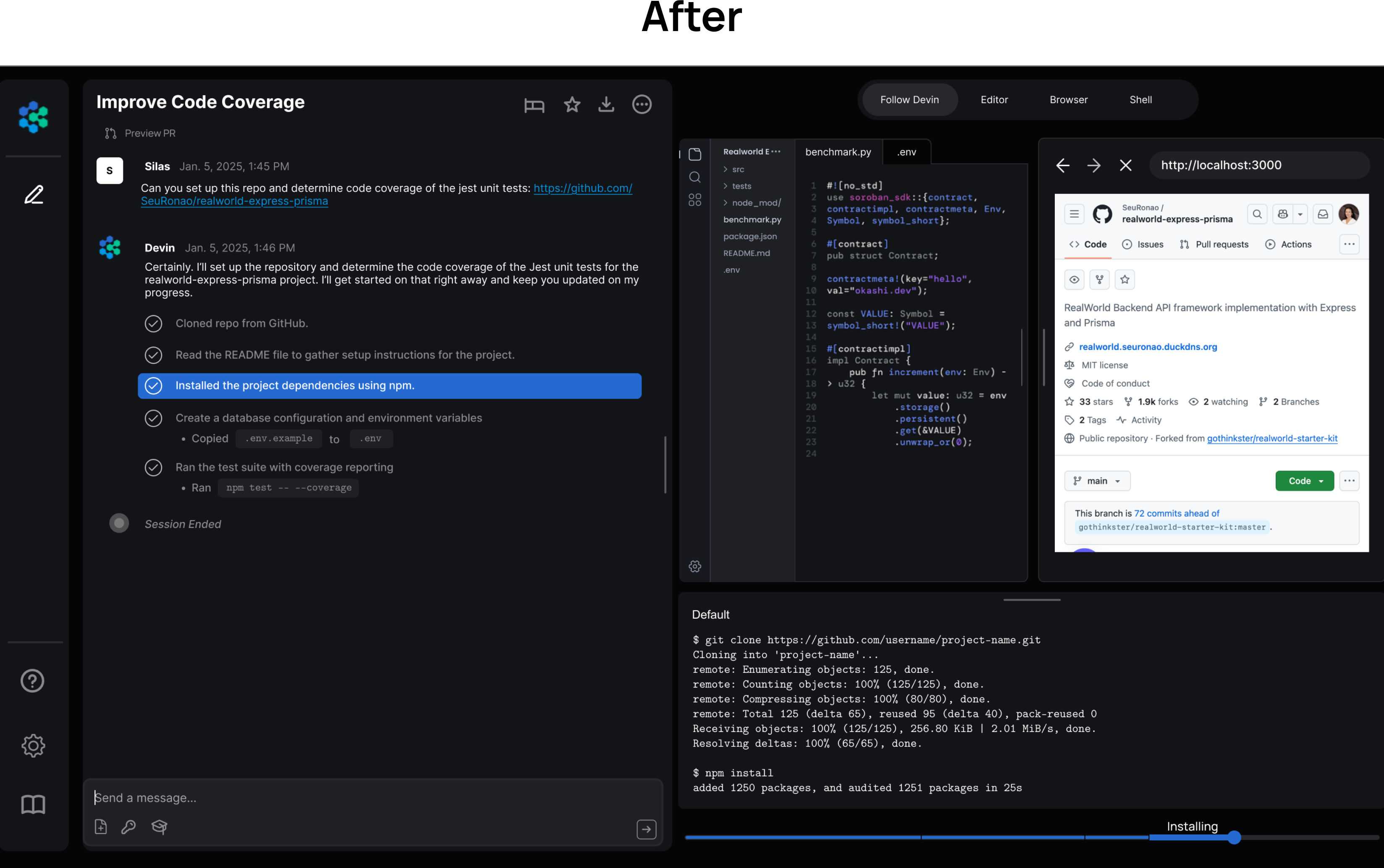
Compartmentalize the left side as text only and the right side as dev only. This creates information separation in the user’s mind between what Devin is “saying” versus what it is “doing,” making the interface easier to follow.
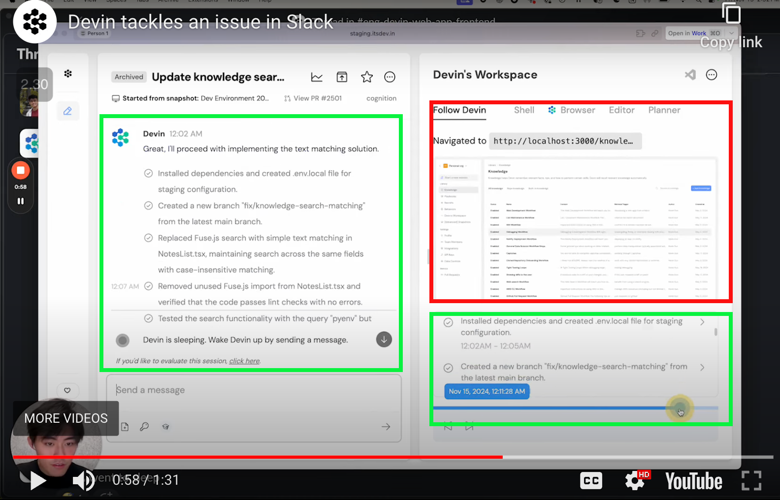
Clicking on any step of the history transcript should rewind the scrubber to the relevant time stamp. This is shown with the highlighted chat history scrolling to the relevant scrubber location. Additionally, chapters and labels should be automatically created on the scrubber. This creates a clear correlation between the human’s question, Devin’s decision, and resulting actions.
Reduce the UI’s friction by increasing information density on the developer panel. Specifically, display the Shell, Browser, and Editor in compact form in the left pane. Then, allow the user to expand and collapse relevant panels should they need.
Created by Grace
This redesign provides a more intuitive, streamlined UI that keeps developers “in the flow” by clearly separating communication from development, introducing traceable context, and unifying critical dev tools. Excited for the future of Devin :)
BLOOPERS